Peopleware

Probably the worst name for a book ever, but one of the best books on software development ever… It is a classic but surprising how may people don’t know it so mentioning here. It was recommended to me by Tony Wasserman and changed how I thought of software teams.

9780321934116

It was written a long time ago, so you can skip the sections about how to optimally arrange cubicles! The rest is pretty good.

Collaboration on UX

So, I have a pet thesis…. it goes something like this… Open Source, as we know it out there in the wild, is a code-centric pursuit. Its roots are in code, the culture is all about developers solving problems, the tooling is code-centric, and the culture values code above all else. That is not a very controversial thesis so far. However, I have experienced a lot of kickback when I get to the next bit… and that is, open source has both succeeded and failed because of the these characteristics.  It has succeeded to produce a lot of code, and a lot of tools and libraries that developers need, but it has failed in any category of software where the primary beneficiaries of the software are not developers.

To me it makes sense. But bringing it up has produced so much blowback, notably from long-time open source practitioners, that it only reinforces to me the truth in the mini thesis. There is a huge blind spot in open source culture that does not recognise where it has failed. It is a pity because I believe the first step in succeeding in these areas is to recognise why open source has failed. Only then can you fix it.

I believe it will take a long time to change this and I once had aspirations to be part of the fix-it movement, but I think it’s too long a game so I have elected instead to play a part in addressing these issues in realms where I know I can have an immediate effect. Hence, in Coko,  a not for profit I co-founded,  we are spending a lot of time to see how we can create an open source project that values all contributions as much as traditional open source values code contributions.

Part of this is making way for UX design. It is pretty much the high-value role, when it comes to conquering the most obvious limitations in open source, since it is where the rubber hits the road when it comes to ‘user’ meets software.

In the Coko community, Julian Taquet and Nick Duffield (eLife) are putting a lot of time into this with the able assistance of Yannis Barlas (there has also been a lot of excellent input from Sam and Tam from YLD and others). I’ve shepherded the process from a distance – setting the scene and making the space for the right people to do the right work and making sure this work has the right value accorded to it in the Coko culture.

So, in essence, we have realised that collaboration in UX comes down to three things:

  • identifying the common ground
  • tooling
  • process

Common Ground

Identifying the common ground actually took some discussion. We initially thought the common ground – think of it as UX space shared across projects – was on the page-level. We thought, for example, one org would need a dashboard and so they make it and others can use it. While this is true for a limited number of specific page level components it soon became obvious that there was a higher opportunity for reuse should we break the page-level components down into smaller components. We then had a short period of lexicon confusions (“duh. what sort of component is a login?”) until we settled on Brad Frost’s atoms and molecules concepts and lexicon.

After that, we could make faster progress as we had identified, and could talk about, a new level of component that had infinitely more opportunities for reuse across projects.

That was the highest level common ground we identified.

Tools

Next, we moved onto tooling… there had been a lot of discussion about this. The trick was to get the designers to experiment with and understand the options. It also highlighted the fact that in each collaborating org there was a different workflow that might play into some discussions and not into others. For example, Julian from Coko does as much of the tweaking of CSS variables and values in the code, whereas Nick from eLife does the design and then hands these designs to others to implement. So, in many ways, the questions about tooling are informed by these workflows ;and different people, even if identified as having the same kind of role, have very different questions and needs. This is important to take into account and we will need to keep this very much in focus as we go forward. One easy way to keep issues of this in focus is to always insist that any discussion, workflow change or feature that affects design workflow must include the designers in that conversation. You get better results and people are much happier! Not to mention that it saves a lot of time as there is more informed discussion as you progress and fewer possibilities for major rollbacks because someone wasn’t looped in.

This conversation on tooling took quite a few weeks; there were many options on the table and we wanted to make sure the right people were in the right conversations. It came to a close, for at least the foundational stage, when Nick and Julien met with Yannis in Athens for a 3 day UX meet and nailed down the final agreements on tooling (amongst other things). This highlights to me also the need for periodic in person meets if you can manage it, as required. You can clear out a lot of ‘hanging issues’ in one swoop if you meet in person for short focused bursts.

Below are some pics from this very important meet in Athens showing Nick, Julien, and Yannis at work on the whiteboard in our Athens office.

image-1

file

image-2

We now have general agreement on the use of CSS styled components, as well as an understanding of what a basic atom or molecule would look like, a high-level list of agreed design principles, an approach to ‘plain vanilla’ theme with org-specific overrides, and a prescribed set of common CSS variables.

You can see the embryonic documentation about design decisions here – https://gitlab.coko.foundation/pubsweet/design

So, the crew nailed down the tooling with a few things left to discuss. There are many tools in the design/UX workflow. Unfortunately, there are not many good open source tools to support open source design workflows. That is because of the limited scope of open source projects to involve designers as I mentioned above. So design has not been seen as a priority and, consequently, the tooling is not there. You can see this in GitHub and GitLab – where are the tools that support designer workflow?

Process

Which brings me to the final item – process. We are still working this out, but essentially each org will design components as needed, and then scope these to common established CSS variables, and then ask for feedback through Mattermost. When agreed, the component will be built and committed to the common styleguide for reuse. When the flow is established it should be a pretty fast way of working. The idea being, in essence, that atoms and molecules are developed for a target, common, ‘plain vanilla’ theme, and then each org can have their own theme that will use those common components and apply their own CSS values to the common variables.

After writing the above I asked Julien if it all looked ok, he wanted to make the following additional point about tooling and sharing design ideas and mocks:

For now, we’ve stopped the conversation at ‘let’s share svg through syncyng folders and see how it goes’.

The only things that will stay in the library of components, shared for all Pubsweet apps (from Coko and others), is the code. Therefore, since there is no easy way to test mockups with different themes (which is the thing that we would need), we will end up sharing png and discussions (for which, the Increment project could be helpful: https://gitlab.coko.foundation/adam/increment).

So for now, I don’t think we can say more, specifically if we don’t want to force the user on a specific tool.

In other words, the atoms and molecules will go into the shared component library, but the mocks and discussions leading up to the creation of the components will occur elsewhere. This is because the current open source software development tools don’t support these processes (collaboration around iterative design in a live environment).  Julien also makes the point that the mocks will also be shared as SVG since that allows each org to decide for themselves which environment (design software) they will use to create the mocks, so SVG, in a way, acts as an interface between the collaborating designers.

It sounds simple, but it takes time to work out simple solutions. We are also finding that there are no established models for collaborating on open source UX that we know of that we can follow… so discovery always comes with an overhead but it’s also exciting to be leading, in some small way, with creating a demonstrable real ‘in the wild’ example of how to collaborate across orgs on UX design in an open source project.  That comes with its own challenges, and with its own sense of satisfaction.

PagedMedia Initiative

PagedMedia.org is launching a new community-led development at MIT Press on January 9, 2018. The project will develop a suite of Javascripts to paginate HTML/CSS in the browser, and to apply PagedMedia controls to paginated content for the purposes of exporting print-ready or display- friendly, PDFs from the browser.

This will be an Open Source initiative, appropriately licensed with the MIT license.

The January meeting will be the first meeting of the project and attending will be:

  • Adam Hyde (Coko/PagedMedia.org/Shuttleworth Fellow)
  • Dave Cramer (Hachette/PagedMedia.org/W3C Publishing Work Group)
  • Nellie McKesson (Hederis/W3C PWG)
  • Terry Ehling (MIT Press)
  • Erich van Rijn (University of California Press)
  • Kathi Flectcher (OpenStax/Shuttleworth Fellow)
  • Hugh McGuire (PressBooks/W3C PWG)
  • Arthur Attwell (Fire and Lion/Shuttleworth Fellow)
  • Tzviya Siegman (Wiley/W3C PWG)
  • Travis Rich (pubpub)
  • Fred Chasen (PagedMedia.org/Future Press/W3C PWG)
  • Julie Blanc (PagedMedia.org)
  • Phil Schatz (OpenStax)
  • Julien Taquet (Coko/PagedMedia.org)
  • Ned Zimmerman (PressBooks)
  • Carly Strasser (Coko)
  • Wendell Piez

For further information please contact: adam@coko.foundation

PagedMedia.org is funded by the Shuttleworth Foundation.

Also posted here – https://www.pagedmedia.org/paged-media-open-source-initiative/

Release now…

I come across a lot of projects (especially in the academic realm) that don’t like releasing ‘open source’ code until the code is all nice and pretty. Some also want to get governance structures etc in place before doing anything…

It is almost once or twice a month that I find myself in discussion with a project about this. They are usually very nice people, well meaning, but don’t really have a good handle on how open source works.

Firstly, there is a well-known mantra in software development that is true in general, but particularly true for open source:

Release early, release often

In the open source world, there are very special reasons why this is a best practice and baseline premise.  First, it tells people that are watching, the people that will want to use and/or contribute to your project, that you are serious about open source. If instead, you hold back the code, it sends the signal that you ‘don’t really get it’. I can’t recall a single conversation with an open source advocate that argued for holding back the code until it’s all nice and neat.  So, you’re sending out a signal that you don’t really understand how open source works, and that is a bad look.

This is especially true if there is anyone among your potential target collaborators/partners that have been around the open source block a few times as they will be extremely wary of anyone saying ‘we will release it’…or (worse) ‘it is open source, but we haven’t released it yet’… you might be stating this because you ‘know’ it to be true… but from the ears of the listener (especially and old hand) there is nothing different between what you are saying (which you consider fact) and a promise of sorts. You are asking people to trust you to do this sometime in the future – and people like me, who have heard this a lot, will automatically tend not to believe you. Not because we don’t think you believe this to be true, not because we are inherently distrustful people, but because we have heard so many, many, people say this that have not gone ahead and done it.

If you say it is open source, prove it by handing out the repo URL. Otherwise, don’t expect anyone to believe you or trust you  – and trust, as it happens, is the most important ingredient in successful open source communities. If you wrong foot it at the start, you have just created yourself an unnecessary uphill battle to rebuild trust when (if) you finally do release the code…

Secondly, open source models are all about adoption…. that is the entire market-killing model of open source. Adoption. Open source can kill proprietary products just simply because the threshold for adoption is lower (ie, free to try, free to install, free to use etc). If you wait until everything is in place, then you have just killed one of the most important moments to build interest and adoption – early stage development. Interested orgs/individuals can download the code and see what is about as soon as they hear about it… that way they can see where you are going, and if it is the right direction for them, they may decide to adopt the product (even in early stages) and/or contribute to the project. It is very good if this happens as these early adopters will be the product’s main advocates, drawing in the next layer of interested parties… they become the project’s salespeople. They will be especially good at doing this because they have been in there from the beginning, following and (hopefully) participating in all the discussions and decisions, and so they understand the project in detail and can talk to it with authority. That is invaluable.. .why wait? Don’t wait…if you do, the threshold for getting involved is going to be a lot higher (since there is more to understand) and the burden of helping people understand the project, and ‘selling’ it,  will fall entirely on your shoulders rather than being nicely distributed upon the shoulders of the early adopters…

Lastly… all open source projects grow organically and respond to the needs of the moment. So don’t wait to build governance structures etc before putting the code out there. This is not only bad for the reasons discussed above, but in the early phases of the project, there is nothing to govern…  It is just you (you, literally, or your org)… so first build the community and then look at what infrastructure you need to put in place to run that community. That is what governance is all about ..running the community. So, why not wait and see who shows up, and then decide what the governance structure (etc) should look like.  Also, as a last word, make sure your community is involved in discussing and deciding the shape of the governance…

anyways…just a few thoughts on this from Rarawa beach!

Aperta Halted

A part of my personal history is a platform called Aperta which was previously called Tahi. It was a PLoS project and I was hired to design and build it. I quit when the PLoS Board decided to close the repositories, effectively making it a closed project. The repos remained closed, and as far as I know, are still closed today. Ironically after I left, they renamed the project ‘Aperta’ – Italian for ‘open’. A really silly marketing move to reassure everyone that despite what they may have heard, the project was still open…that was perhaps true, albeit (ironically and literally) in name only.

Now, it seems, the platform dev has been halted. Feels good to me. From what I heard (and I didn’t hear much), PLoS didn’t take the project in a good technical direction and generated a significant amount of bad faith and market confusion while trying to develop it behind closed doors.

To quote the new CEO Allison Mudditt (who I respect very much, Coko worked with Alison when she was at UCP):

Part of this initiative will involve changes around the workflow system – Aperta™ – we set out to develop several years ago with the goal to streamline manuscript submission and handling. At the time we began, there was very little available that would create the end-to-end workflow we envisioned as the key to opening research on multiple fronts. But the development process has proved more challenging than expected and as a result, we’ve made the difficult decision to halt development of Aperta. This will enable us to more sharply focus on internal processes that can have more immediate benefit for the communities we serve and the authors who choose to publish with us. The progress made with Aperta will not be wasted effort: we are currently exploring how to best leverage its unique strengths and capabilities to support core PLOS priorities like preprints and innovation in peer review. This will be part of our planning for 2018.

http://blogs.plos.org/plos/2017/12/ceo-letter-to-the-community-mudditt/?utm_source=feedburner&utm_medium=feed&utm_campaign=Feed%3A+plos%2FBlog+%28Blogs+-+PLOS%29

I hope that PLoS releases the technologies that have been developed for Aperta (there was a lot more than just the submission system) into the open… with both open repositories and open licenses AND, more importantly, an open heart. Collaboration and openness is more to do with how people are than what open license they choose and several of the practices, including asking potential collaborators to sign Non-Disclosure Agreements (NDAs) before getting a demo of the system, were ridiculous and ungenerous.

Having said that, it would be awesome to see all that work released into the open, in open repos with open licenses, and no more blurring of the word ‘open’. Afterall the systems developed that included Tahi were all paid for by researchers. The PLoS Article Processing Charges fuels PLoS and they committed some of this revenue to the development of Tahi. When I was there, no external funding was secured for developing the system. Pedro Mendes made a good point in response to the announcement:

ha

There is some merit to this, but I do applaud PLoS for being adventurous, and if it had worked then the result would have been APCs could be lowered, not just for PLoS, but for any Journal out there reliant on expensive and dysfunctional Manuscript Submission Systems. Allison also notes this in a discussion below the post mentioned above:

…the original idea was that Aperta would allow us to eliminate or speed up the slowest steps between a finished work and its publication in order to reduce the cost of our publishing services

That is true, and it was an admirable goal. However, whatever the journey was between then and now, the project should have always have been out in the open as a public asset. Open for science, open for access, open for source, open for all – and the fact researchers paid for it but it was turned into closed project mid-flight is reprehensible and in the end it worked against PLoS, in particular, it severely weakened PLoS claims to supporting all things open. What a mess.

But, it can’t be ignored that Tahi is about 5 years old now, which is old in software years. A entire generation of technologies that are better suited to solving these problems has arisen in that time. The system is now not much more than a still (just) relevant but outdated approach. That is the risk you take when you develop things behind closed doors. By the time you release it (or don’t in this case), it is out of date. That said, it would still be good to release it, but there are better technologies and approaches out there now.

So I look on with interest to see what will happen next.  I sincerely hope PLoS can return to cutting a path through publishing and exploring and enabling a viable Open Access model that others can follow. With Allison at the helm I am betting things are going to take a much needed turn for the better, not just with this project, but on all counts.

As for me, I learned a lot from designing Aperta (I prefer to call it Tahi). The design process was an introduction to scientific journal publishing for me. I learned a great deal. Tahi gave me, at the time, an unencumbered dream time to imagine something new. It had a lot of interesting innovative approaches and if I had stayed with the project it would have ended up close to where PubSweet is now as I wanted to completely decouple the ‘spaces’ (a concept important to Tahi). It would not have been as good as PubSweet at doing this as a complete ‘decouple’ really has to be imagined from the start, and isn’t as clean if retrofitted. Still, the system would have been a lot more flexible and reusable.

But that wasn’t to be. Don’t get me wrong – I don’t think Tahi was the perfect platform, but it was a pretty good starting point with some significant innovations. At the time, I was looking forward to shaping Tahi with use and to mature it into an excellent system. The good news is, the next platform you design is always better.  I took a lot of what I learned (I have now been involved in instigating around a dozen publishing systems) to my next development, and worked hard to re-conceptualise a new system that avoided some of the mistakes I made with Tahi, and took some of the good parts a whole lot further. That new project is PubSweet and it is looking awesome, and leverages modern technologies and approaches to the max – mainly thanks to the bunch of amazing folks working on it within the Coko team (particularly Jure Triglav) and also now, increasingly, from the collaborators we work with (at this stage mainly eLife, YLD, Hindawi and ThinSlices). Also a huge thanks to the Shuttleworth for backing me, especially because it was at a time (I had just quit PLoS) when it was very much needed. Their backing meant Coko was possible, and consequently, PubSweet and everything else we have done.

Anyways… it was past time PLoS moved on too from Aperta and congratulations to Allison for making the right call, especially given that it would have been a difficult one given the cultural forces at play inside of PLoS.

SignalPath Workflow Design

I wrote a blog post about an emerging method to design workflows, tentatively titled ‘1+1‘. I’m refining this a little and also have spoken to a few people about it, in particular, I stole a few minutes of Anthony Mann’s time (founder of Make us Proud, and YLD) in London over drinks to explore the idea. Interestingly, Anthony immediately saw parallels to signal processing apps which was quite an interesting insight – even more interesting to me as Signal Processing is something I happen to have had a lot of experience in from my artist days. This insight inspired me to think through that connection a little more… so, inspired by the chat with Anthony, the following takes ‘1+1’ a bit further, maybe I’ll iteratively call it ‘SignalPath Workflow Design’…

Signals

If you have never worked with applications such as PureData or (its closed counterpart) MaxMSP, then you may not know what Signal Processing is… these two applications belong to a category of software that is a kind of graphical programming, but very much targeted at (but not limited to) the audio-visual world. Taking PureData as an example, you essentially put objects on a page and draw connectors between these objects.

screenshot-from-2017-12-05-14-02-03

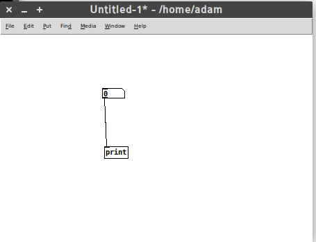
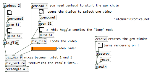
The connectors follow an inlet-outlet model which controls the flow of a signal from one object to the next. In the above diagram, the signal travels from the top object to the bottom object. With time, and a little expertise, you can design very complicated signal paths. The following is a video mixer built with PureData by Luka Princic.

puredata-gem-minimixok-en

If you want to know more about PureData, try this book that was created, in part, in the first non-Book Sprint I didn’t facilitate. There are also some kooky videos around showing Pure Data (PD) in action where the interface is the video – they are pretty cool, like this one or this! And of course, there is always graphical programming that takes the graphical literally.

So, how does this relate to workflows? Well, Anthony pointed out that situating a common Dashboard as the place all stakeholders go, to see what they have to do, and which links out to the place where they have to do it – is a basic signal processing model. A signal is fired off on the Dashboard, which the user of the software sees (the signal) and then they click on the link through to the space where they need to do it (essentially following a signal path). Ultimately, creating ‘signal paths’ should be easy to do in a workflow system as it is PureData, but we aren’t there yet. However, it is useful to take this Signal Processing metaphor into our design process as it gets across the basic idea… workflow is a series of signals, and signal paths. It is no more than that. Once we understand that, we can start designing the signals and the signal paths and, perhaps more importantly, even if it does take a little bit of coding, designing like this also has inherently embedded in it the idea that to change a workflow is merely rearranging (additively or  by subtraction), the order of signals. If we can execute on this we can easily optimise workflows ‘as we go’ and avoid hardcoded prescriptive systems which have become the malignant virus in publishing today.

Also, just as an aside, the common dashboard, as useful as it is here for talking about objects (which snuggly fits in with the PureData metaphor), the dashboard is not critical. It is the orginating signal that is critical, it doesn’t matter where it emanates from. It could be from a dashboard, but equally, it could come from email, an app, chat notification…whatever. I am indebted to Anthony for making this salient point.

Spaces

In the world of Signal Processing software, the signal travels from one object to another by following a signal path. In the world of platforms that encapsulate workflows, the signal carries the user from one space to the other. Let’s just say, for simplicity’s sake, the originating space is the dashboard. So, a signal (these are notifications in the software world so I will use these interchangeably) is witnessed by the user, who then clicks through to the space where they have to do what they have to do.

Let’s look at a concrete example from the word of journals – a Managing Editor needs to sanity check all new submissions. They see a new submission appear on their dashboard. Next to it is a link, and they click through to the submission and read through it. That is a simple signal path, in this case, a notification path directing a user from one space (dash) to the other (submission page).

So this is pretty simple: the interesting thing to note is that we could go through every step in a workflow and map out this signal path. Who needs to do what is what defines a ‘step’ in a workflow. If we listed this out for any workflow, it would look something like this, formatted as who does what for each step:

  1. author fills out submission data
  2. managing editor checks submission data
  3. managing editor assigns handling editor
  4. …etc

So, we could map this out one step after the other and draw a simple signal path for each step, until the whole workflow is accounted for. The problem here, is that if we were to design a system like this, we would have a whole lot of unique objects (spaces) with each step showing a signal originating on a dashboard and then ‘carrying the user’ to a unique space. That’s not very helpful as you would soon end up with hundreds of one-action unique spaces.

Instead, what we must do is follow the ‘1+1’ model I wrote about earlier. The basic principle is to reuse spaces as much as possible, and only add new ones when we absolutely can be sure the existing spaces can’t be reused.

In action… if you consider the above three steps in a workflow, you will note that the first 2 steps involve doing something with submission data. So, let’s just reuse that same space. That way we have covered two-thirds of the above 3 steps with just 1 new space (apart from the dash).

If we can do this through the entire workflow, we will, if disciplined, end up with a very simple diagram of spaces. For example, for Collabra Psychology Journal we have the following:

ya22

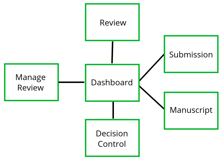
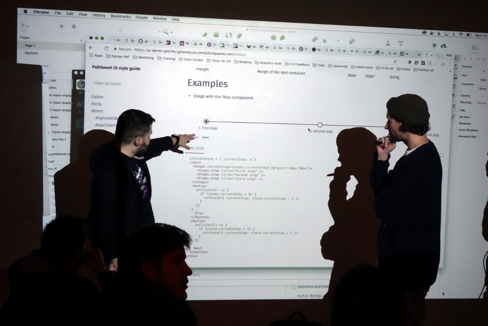
That’s it… it will pretty much cover the workflow of most journals. The thing to understand when capturing the workflow in the above is not only the spaces, but the order of signals. If you want to see how this applies to Collabra, have a look at the slides I put together outlining this. You can also check out the same method applied to the Wormbase micropublications platform.

The Dash, Single Actions, and Flexibility

As mentioned above, the dashboard is a handy mechanism to originate the signal/notification to someone that something has to be done, and then ‘carry them’ there via a link etc

However… when designing systems like this, it is also important to recognize the difference between a single action that could be easily executed from the dashboard (ie. without ‘going anywhere’) and an action that requires an additional space from which it can be executed. This line is fuzzy since single actions could be placed anywhere.  For example, let’s take steps 2 and 3 in the workflow described above. The Managing Editor can view the submission and then the only thing they need to do is assign a Handling Editor (not quite true, they have a choice of simple actions, but let’s just go with this for now). If we know the preset list of Handling Editors (Journals always do) then we can simply choose one from a dropdown list. Done. I would argue that this action is best placed on the Dashboard. That does mean that the user (Managed Editor in this case) has to follow the ‘signal path’ from Dash to Submission, read the submission data, and then ‘travel back’ to the Dash to execute this assignment. That isn’t a terrible burden on the Managing Editor, but I can see why someone would argue that this action should instead be placed on the Submission page to simplify things and avoid this ‘additional travel’.

I can see that argument but if we do this we create very conditional interfaces that are fixed to one prescribed order of signals and is hard to change later. To avoid this I believe we should try and avoid as much conditional logic as possible in spaces other than the dashboard. If we embed the conditional logic only in the dash, then we have only one place to change when we decide at a later date to further optimise the workflow.

The knock on effect of this is that each space really is an operational context where actions of a certain kind take place… for example, in the Collabra spaces diagram above, we have a ‘Manage Reviewer’ space. All those that see this space, to avoid embedded conditional logic, should see the same thing. Whoever sees this space, sees all the tools necessary to manage a review for a specific paper. The trick is then only to enable or disable access to these spaces according to a set of pre-determined attributes or criteria. If we can do that, then optimising a workflow really is a matter of re-ordering signals, and very little other system tweaking needs to be applied.

How to use Signal Path Flow Design

The process is actually quite simple:

  1. right down a who does what order of signals, optimise as you go
  2. start with a dashboard (its a handy starting point) and go through the workflow step by step
  3. at each step ask yourself, is this a single action best handled on the dashboard? or do I need another space?
  4. if you need another space, see if you can use an existing one. If you can, use that.
  5. If you can’t use an existing space create a new one

There is a bit of wrangling needed, but so far I have found this a pretty effective way of capturing seemingly complex workflows in relatively simple systems, systems that can also be ‘easily’ optimised over time.

PagedMedia

Through my Shuttleworth Fellowship, I am kicking off a new project this week – PagedMedia, focusing on the development of a JS implementation of PagedMedia CSS spec and pagination. It is a new project which addresses a problem I have been looking for ways to solve for a very long time, since 2010 or so.

Fred Chasen and Julie Blanc will be doing all the hard work. Both awesome people and I’m very excited to see this get started!!!