Designing for All

At Coko we are tackling the long unsolved problem of design in Open Source. I have written a bit about this elsewhere, and it is a hard problem to solve, mainly because it is not solved anywhere – there are no good community models for this and very little discourse about the issue.

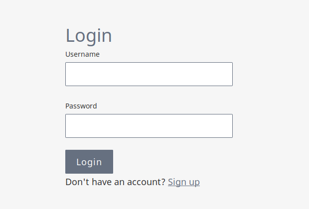
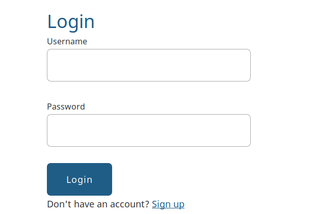
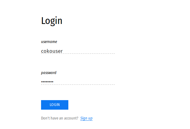
Design, of course, covers many things. I am chiefly talking about UX, although we have also solved the problem of designing for users by getting users (I prefer to call them ‘use case specialists’) to design their own systems. But this is not about that. I want to talk just about community processes for UX that will yield common best practices, while also enabling each organisation to realise their desired aesthetics ie achieve the look and feel they want that best reflects their organisation. As reflected in the following screenshots of xpub-Hindawi, xpub-eLife, and xpub-collabra:

b

c

a

There are several mechanisms that we have employed to achieve this. The first is that we have ‘elevated’ design to the same level of value in the community as code. I say ‘elevated,’ not because we had to raise its value in the Coko community, but rather the estimation of the value of design in the open source community at large is very low. So, against this, as a baseline, at Coko we have chosen to value design more than in your typical open source project. Also, I don’t want that to imply there are other disciplines in the software development process that do not rank as highly as these two – documentation, feedback, testing and so on… these are all equally valued alongside design and code, but for now I want to focus just on UX design.

To ‘elevate’ design, it took just the simple step of stating it to be so. As the co-founder of this community I have some sway over the direction and form of the culture. So I cashed out some of this capital to make a very simple statement when I was facilitating a community meeting that we must value design as much as we value code. It was this simple statement that set a placeholder for building processes that put design in the value-center of the community.

Next, when there was a call for more processes to assist communication across the various orgs, I made sure we had two work groups which each consisted of one person from each collaborating organisation. These two foundational WorkGroups were the Dev WorkGroup and the Design WorkGroup.

The Design WorkGroup then went ahead and started discussing how we might contribute to a platform where each org could have the look and feel they wanted. It was a process of first understanding the problem and then working through possible solutions. It was necessarily like this, a process of discovery before implementation, because there are not very many established or discussed processes like this in the open source world that we could follow (as mentioned above). So we have to discover the problem, and then invent a solution.

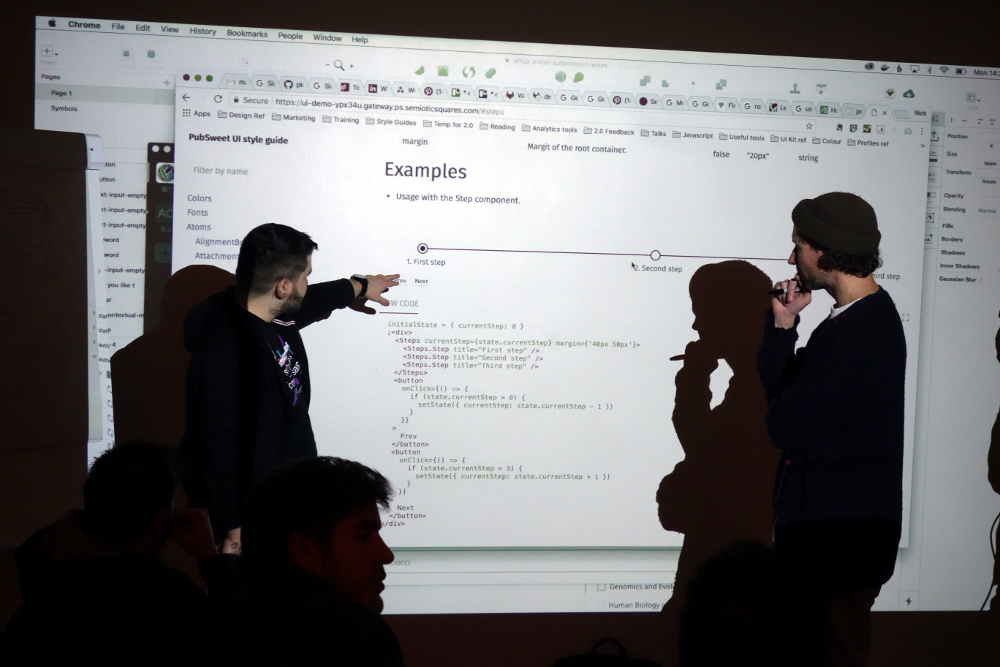
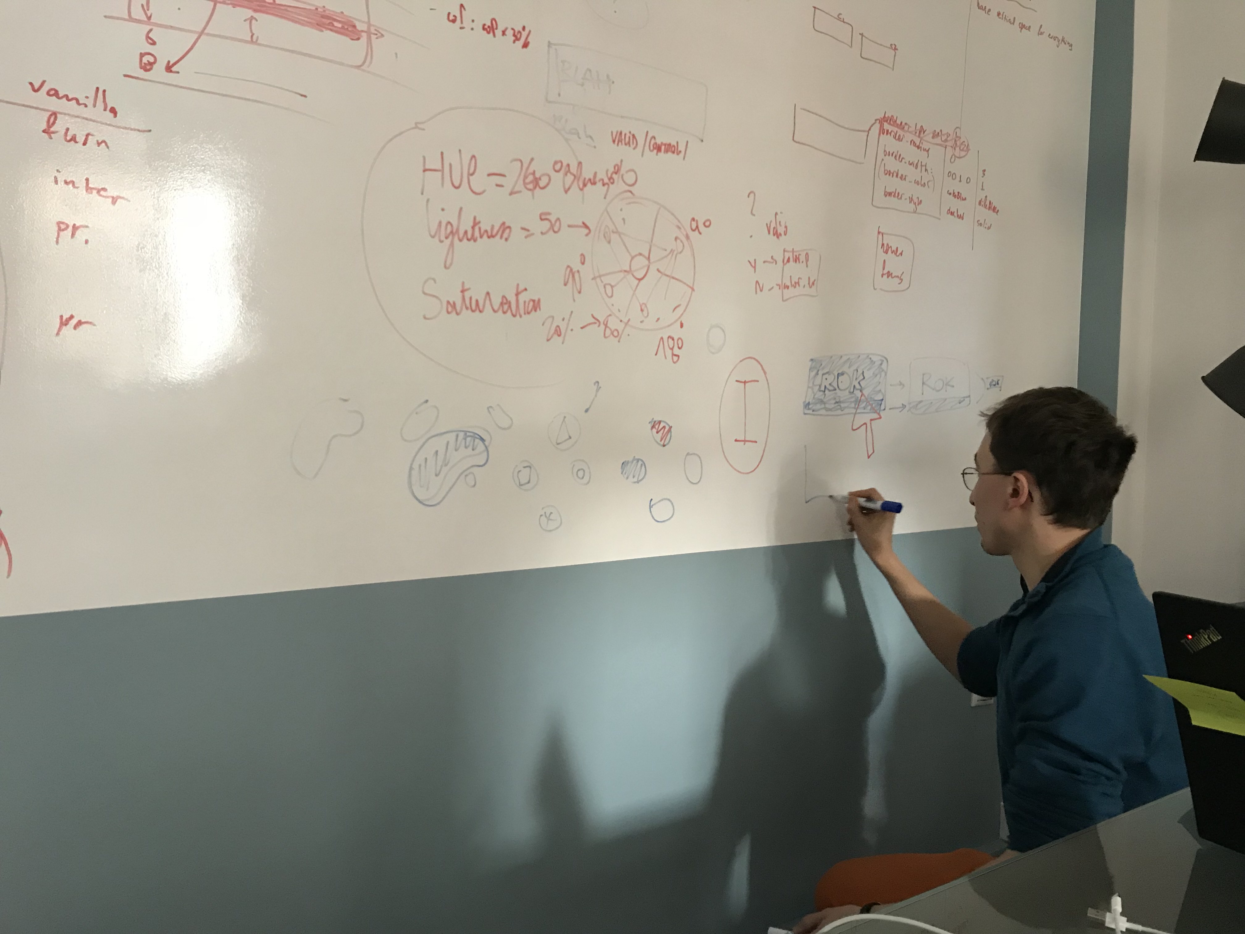
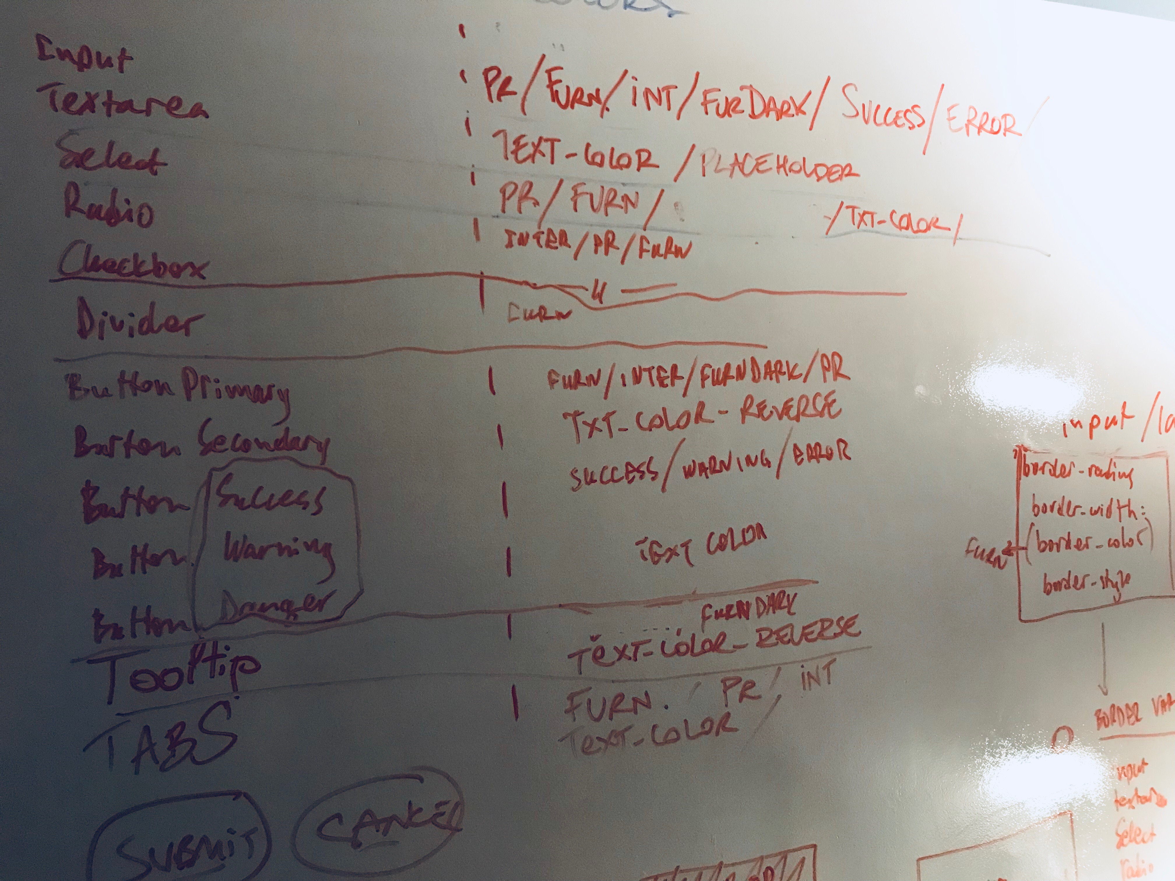
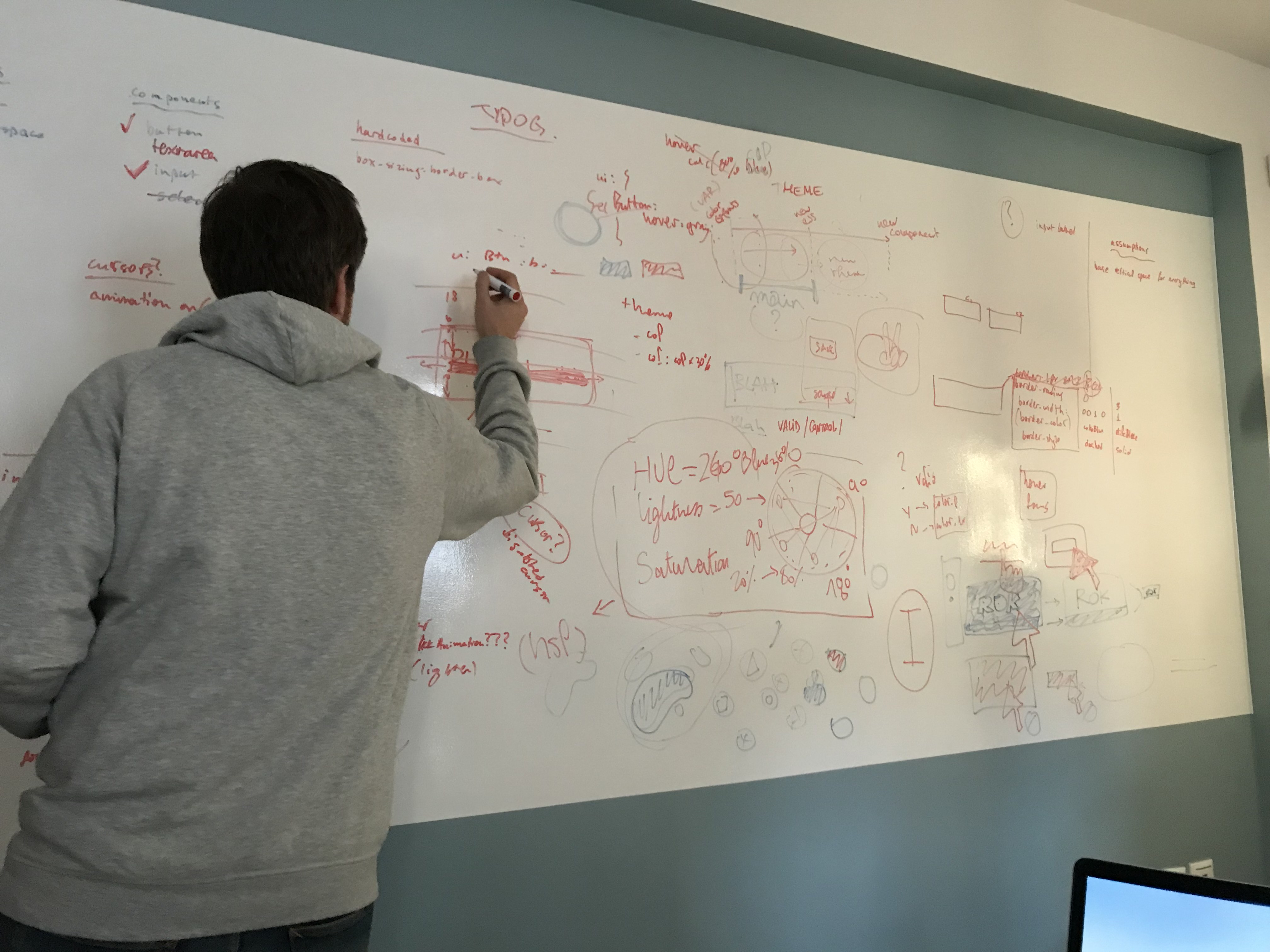
The problem boils down to small levels of abstraction. Interfaces are, after all, made up of many small parts. The problem therefore resided in how to account for different stylistic approaches to, what we now call, atoms (see Brad Frost’s article on Atomic Design), and how atoms fit together to form ‘molecules’ ie. we needed a level of abstraction that would allow any org to have the look and feel  they wanted for an (eg) button, and also how that button was situated with other elements.

Julien Taquet (Coko) and Nick Duffield (eLife) met with Yannis Barlas (Coko) in Athens for three days to thrash this out.

image-2

They came up with an agreed common set of standardised CSS attributes per UI element, and associated reusable CSS variables that could be used across any UX element.

You can see these lists here…

  1. Color Variables
    https://gitlab.coko.foundation/pubsweet/design/issues/1
  2. Typography Variables
    https://gitlab.coko.foundation/pubsweet/design/issues/2
  3. Form Variables
    https://gitlab.coko.foundation/pubsweet/design/issues/3
  4. Spacing Variables
    https://gitlab.coko.foundation/pubsweet/design/issues/4

That is the simple starting point. In effect, this means that if any organisation designs a feature using UI elements (eg a login form) they can use these shared style names and populate them with their own values. This means another org’s stylesheet will apply equally well to inherited/reusable components as it does to the ones they build themselves.

Which seems simple: it is… but understanding the problem space, and where the commonality lies, was half the battle.

The group has now also identified a common set of UI elements that can be reused and are iterating through this list, designing them as they go. See https://gitlab.coko.foundation/pubsweet/design/issues/21

This is required because even the simplest UI element may have several contexts it has to account for. Take the example of a ‘simple’ button, one of the simplest UI elements of them all…. however, there are actually 5 different button states that must be accounted for – the default state, active, hover, pressed and disabled. In each case, the style variables must be applied appropriately. See here for more information – https://gitlab.coko.foundation/pubsweet/design/issues/19

So, it’s not quite as easy as it might first seem.. the good news is that the teams are very committed to working through these issues, as without doing this groundwork, components are really not reusable.

dsc05093

The result is you can grab components that another org has made, be it a page-based component (eg. Dashboard), or a molecule (eg a Staff Assignment dropdown) and plug it into your system and it will look like it is part of your system.

We are making good progress on all of this, including now integrating common best practices for accessibility into the design process. Also, since this groundwork has come quite far, new orgs joining the Coko community can benefit a lot from the work already done and pick up components from the shared/common UX stylebook and integrate them… pretty cool….

Collaboration on UX

So, I have a pet thesis…. it goes something like this… Open Source, as we know it out there in the wild, is a code-centric pursuit. Its roots are in code, the culture is all about developers solving problems, the tooling is code-centric, and the culture values code above all else. That is not a very controversial thesis so far. However, I have experienced a lot of kickback when I get to the next bit… and that is, open source has both succeeded and failed because of the these characteristics.  It has succeeded to produce a lot of code, and a lot of tools and libraries that developers need, but it has failed in any category of software where the primary beneficiaries of the software are not developers.

To me it makes sense. But bringing it up has produced so much blowback, notably from long-time open source practitioners, that it only reinforces to me the truth in the mini thesis. There is a huge blind spot in open source culture that does not recognise where it has failed. It is a pity because I believe the first step in succeeding in these areas is to recognise why open source has failed. Only then can you fix it.

I believe it will take a long time to change this and I once had aspirations to be part of the fix-it movement, but I think it’s too long a game so I have elected instead to play a part in addressing these issues in realms where I know I can have an immediate effect. Hence, in Coko,  a not for profit I co-founded,  we are spending a lot of time to see how we can create an open source project that values all contributions as much as traditional open source values code contributions.

Part of this is making way for UX design. It is pretty much the high-value role, when it comes to conquering the most obvious limitations in open source, since it is where the rubber hits the road when it comes to ‘user’ meets software.

In the Coko community, Julian Taquet and Nick Duffield (eLife) are putting a lot of time into this with the able assistance of Yannis Barlas (there has also been a lot of excellent input from Sam and Tam from YLD and others). I’ve shepherded the process from a distance – setting the scene and making the space for the right people to do the right work and making sure this work has the right value accorded to it in the Coko culture.

So, in essence, we have realised that collaboration in UX comes down to three things:

  • identifying the common ground
  • tooling
  • process

Common Ground

Identifying the common ground actually took some discussion. We initially thought the common ground – think of it as UX space shared across projects – was on the page-level. We thought, for example, one org would need a dashboard and so they make it and others can use it. While this is true for a limited number of specific page level components it soon became obvious that there was a higher opportunity for reuse should we break the page-level components down into smaller components. We then had a short period of lexicon confusions (“duh. what sort of component is a login?”) until we settled on Brad Frost’s atoms and molecules concepts and lexicon.

After that, we could make faster progress as we had identified, and could talk about, a new level of component that had infinitely more opportunities for reuse across projects.

That was the highest level common ground we identified.

Tools

Next, we moved onto tooling… there had been a lot of discussion about this. The trick was to get the designers to experiment with and understand the options. It also highlighted the fact that in each collaborating org there was a different workflow that might play into some discussions and not into others. For example, Julian from Coko does as much of the tweaking of CSS variables and values in the code, whereas Nick from eLife does the design and then hands these designs to others to implement. So, in many ways, the questions about tooling are informed by these workflows ;and different people, even if identified as having the same kind of role, have very different questions and needs. This is important to take into account and we will need to keep this very much in focus as we go forward. One easy way to keep issues of this in focus is to always insist that any discussion, workflow change or feature that affects design workflow must include the designers in that conversation. You get better results and people are much happier! Not to mention that it saves a lot of time as there is more informed discussion as you progress and fewer possibilities for major rollbacks because someone wasn’t looped in.

This conversation on tooling took quite a few weeks; there were many options on the table and we wanted to make sure the right people were in the right conversations. It came to a close, for at least the foundational stage, when Nick and Julien met with Yannis in Athens for a 3 day UX meet and nailed down the final agreements on tooling (amongst other things). This highlights to me also the need for periodic in person meets if you can manage it, as required. You can clear out a lot of ‘hanging issues’ in one swoop if you meet in person for short focused bursts.

Below are some pics from this very important meet in Athens showing Nick, Julien, and Yannis at work on the whiteboard in our Athens office.

image-1

file

image-2

We now have general agreement on the use of CSS styled components, as well as an understanding of what a basic atom or molecule would look like, a high-level list of agreed design principles, an approach to ‘plain vanilla’ theme with org-specific overrides, and a prescribed set of common CSS variables.

You can see the embryonic documentation about design decisions here – https://gitlab.coko.foundation/pubsweet/design

So, the crew nailed down the tooling with a few things left to discuss. There are many tools in the design/UX workflow. Unfortunately, there are not many good open source tools to support open source design workflows. That is because of the limited scope of open source projects to involve designers as I mentioned above. So design has not been seen as a priority and, consequently, the tooling is not there. You can see this in GitHub and GitLab – where are the tools that support designer workflow?

Process

Which brings me to the final item – process. We are still working this out, but essentially each org will design components as needed, and then scope these to common established CSS variables, and then ask for feedback through Mattermost. When agreed, the component will be built and committed to the common styleguide for reuse. When the flow is established it should be a pretty fast way of working. The idea being, in essence, that atoms and molecules are developed for a target, common, ‘plain vanilla’ theme, and then each org can have their own theme that will use those common components and apply their own CSS values to the common variables.

After writing the above I asked Julien if it all looked ok, he wanted to make the following additional point about tooling and sharing design ideas and mocks:

For now, we’ve stopped the conversation at ‘let’s share svg through syncyng folders and see how it goes’.

The only things that will stay in the library of components, shared for all Pubsweet apps (from Coko and others), is the code. Therefore, since there is no easy way to test mockups with different themes (which is the thing that we would need), we will end up sharing png and discussions (for which, the Increment project could be helpful: https://gitlab.coko.foundation/adam/increment).

So for now, I don’t think we can say more, specifically if we don’t want to force the user on a specific tool.

In other words, the atoms and molecules will go into the shared component library, but the mocks and discussions leading up to the creation of the components will occur elsewhere. This is because the current open source software development tools don’t support these processes (collaboration around iterative design in a live environment).  Julien also makes the point that the mocks will also be shared as SVG since that allows each org to decide for themselves which environment (design software) they will use to create the mocks, so SVG, in a way, acts as an interface between the collaborating designers.

It sounds simple, but it takes time to work out simple solutions. We are also finding that there are no established models for collaborating on open source UX that we know of that we can follow… so discovery always comes with an overhead but it’s also exciting to be leading, in some small way, with creating a demonstrable real ‘in the wild’ example of how to collaborate across orgs on UX design in an open source project.  That comes with its own challenges, and with its own sense of satisfaction.