The big 4

I’ve been in the business of trying to work out how to get Publishing (capital ‘P’) into the web. From the start, there have been some ‘big ticket’ items that have needed to be solved. Some are more urgent than others, but by and large we are cracking these nuts one by one. I have considered for a long time the big 4 to be:

  1. MS Word to HTML conversion
  2. an open source web-based word processor
  3. paginated output via the browser to print-ready copy
  4. in-browser designer

1,2 an 3 are the ‘now’ critical items, number 4 is necessary but a little further down the line. Thankfully, at Coko we are solving these first 3 problems. To solve (1) we are building XSweet, a comprehensive (open source) XSLT conversion suite for converting MS Word to HTML. We are also building Wax to solve (2), Wax is an open source web based word processor based on the Substance.io libs. And for (3) we are using Vivliostyle for in-browser rendering. Number 4) is still on the cards.

Interestingly, the pagination technology (3) might need re-evaluating since pagination will eventually be required for the editor and the in-browser designer.

While pagination inside a web-based processor is not critical for publishers, it is critical for authors and small offices etc and if we are going to get publishers to use a web-based word processor then it would be better that they share infrastructure rather than sit on their own island of technology ie. eventually we need authors to use these tools too. By sharing infrastructure I don’t mean they need to use exactly the same tools, they just need to use compatible tools. So, eventually, we need to migrate authors into the web. It is not critical now, but over time, as the workflow for authors and publishers inevitably becomes more integrated, it will turn out to be necessary.

For in-browser design we need pagination support also so we can work off a single source for the content and then design in the browser to output to the various formats publishers need. Think Gimp or InDesign in the browser. It’s not as far away as it might sound, but to do this we need to be able to paginate inside the browser and have that update with live style changes to CSS.

So far, we are solving the big ticket issues 1-3, but for the next stage of changes we may need to change the tools we use for pagination so we can live-update content and styles and reflow in an editor and in-browser designer. That may mean we to start looking for a different pagination solution.

In-Browser Design

The page is changing in so many ways – time-based media is making its way into book pages, reactive content, scrollable space, and a multitude of differing display devices make designing pages pretty hard work these days. How to design for so many possibilities? How to understand so many possibilities?

Craig Mod of flipboard makes a very compelling argument for two forms of page : formless and definite content in an article he wrote for Book: A Futurists Manifesto – the first book to be produced by PressBooks. Craig’s argument, in a nutshell and in his own words is:

the key difference between Formless and Definite Content is the interaction between the content and the page. Formless Content doesn’t see the page or its boundaries; Definite Content is not only aware of the page, but embraces it. It edits, shifts, and resizes itself to fit the page [...] Put very simply, Formless Content is unaware of the container. Definite Content embraces the container as a canvas.

Craig argues that most book content we know is formless – the text can reflow into other containers without affecting the meaning. This position is in tension to the thinking of most book designers today. Designers of paper books design contained space and desktop publishing applications are built to manage pixel-perfect manipulation within a strictly defined and known container. If the finished digital article does not exactly co-relate to the printed artefact then something went wrong; it is assumed that either the designer, or the tool, has done a bad job.

Those familiar with this kind of process are uneasy with designing formless content – how can you design a page when you do not know its container? It is literally like asking a book designer to design a book without telling them the page dimensions. Web designers, on the other hand, have been thinking about page design too, and they have for a long time, at least in part, been designing for formless content.

The design of formless content is really a partially-formless, partially-constrained design process since elements within the page have some kind of relationship to each other, and they can have relationships to characteristics of a page, such as top or top left, for example. These relationships are defined by rules, the same rules I have discussed previously – CSS aka Cascading Style Sheets. Relationships can be articulated with CSS which will be preserved when displayed in different contexts. The meaning is preserved by the relationship between the elements and page features more than by their relationship to the the exact x,y position of a page with a specific dimension, although strict placement is possible. This is the job of Cascading Style Sheets – the design language of the web. It is rule-based design with some conditional arguments and it is the method for designing electronic books; it will become, increasingly, the technology for describing the layout and design of paper-based print.

All of this can be manipulated in the browser. In fact, the browser is the best place to design flowable text since it is the flowable type environment of our time and, as mentioned before, the browser (Webkit) is the background technology for many e-readers. We have not yet seen the development of very good flowable design environments in the browser, but that is changing. The closest we have seen so far are the ‘in-browser’ design environments that some internet service providers make available for their customers to ‘design their own website online!’ While actually quite powerful, these environments are generally horrible to use, but this practice is applicable to the design of ebooks.

The desktop publishing world is not taking this lying down, and Adobe, in particular, has been pursuing what they call “Adaptive Design Tools” for the production of ‘liquid content’. Liquid content is flowable content, content that can rescale and position itself to fit the container. Adobe’s tools are intended for content targeted for mobile devices and tablets, although they also identify a role for it in print production. Adobe’s yet-to-be-released Adobe Edge is the product targeted at this flowable design process and their background technology for this design environment is – Webkit, the same browser mentioned earlier. Webkit is the ‘design surface’ for the new generation of desktop design tools coming from established publishing technology providers.

Coming back to the paper book. Until recently it has been extremely difficult to generate a PDF that exactly co-relates to what you see in a browser. Until now the browser accessed the PDF-creation features of the operating system. Hence a PDF from the same browser would look different if that browser were running in Windows, Mac or Linux. Just recently this has changed and the browser itself is now making the PDF. Chrome has been pioneering this ‘Native PDF’ output from the browser and the output looks exactly as you see it in the browser. One to one co-relation of content in the browser to the content in the PDF is a breaking point which points the way to designing your paper book in a browser. We are getting to the point where you can use a browser just as you would a desktop publishing application to design paper books.

The browser can now play every part of the book production process except the actual printing (although from the browser you can upload PDF to print-on-demand services such as Lulu.com).

What this means is that you can write a book in the browser, while at the same time it is being proofed and edited, and designed. Each part of this formerly-linear production cycle can now become synchronous. You can now write, edit, proof, design the book ‘in the book’.
WYSIWYG vs WYSI

HTML is the new paper and the new path to paper online editing environments are becoming much more important for publishing. Dominant until now has been the WYSIWYG editor we all know and…err…love? However, the current WYSIWYG paradigm has been inadequate for a long time and we need to update and replace it. Producing text with a WYSIWYG editor feels like trying to write a letter while it’s still in the envelope. Let’s face it…these kinds of online text editors are not an extension of yourself, they are a cumbersome hindrance to getting a job done.

Apart from huge user experience issues the WYSIWYG editor has some big technical issues. Starting with the fact that the WYSIWYG editor is not ‘part of the page’ it is instead its own internally nested world. In essence, it is an emulator that, through Javascript, ‘reproduces’ HTML. As a walled/emulated garden, it is hard to operate on the objects in the garden using standard Javascript libraries and CSS. All interactions must be mediated by the editor. The ‘walled garden’ has little to do with the rest of the page – it offers a window through which you can edit text, but it does not offer you the ability to act on other objects on the page or have other objects act on it.

Thankfully a new era of editors is here and maturing fast. Still in search of a clearly embraced category name they are sometimes called ‘inline editors’ or HTML5 editors. This new generation takes a large step forward because they enable the user to act on the elements in the page directly through the HTML5 ‘contenteditable’ attribute. That allows ‘the page’ to be the editing environment which in turn opens up the possibility for the content to be represented in a variety of forms/views. By changing the CSS of the page, for example, we can have the same editable content shown as multi-column (useful for newspaper layout), as a ‘Google docs type’ clean editing interface, in a semantic view for highlighting paragraphs and other structural elements (important for academics), as well as other possibilities….

Additionally, it is possible to apply other javascript libraries to the page including annotation software such as AnnotateIt or typographical libraries such as kern.js. This opens up an enormous amount of possibilities for any use case to be extended by custom or existing third-party JavaScript libraries.

It is also possible to consider creating CSS snippets and apply them dynamically using the editor. This in effect turns the editor into a design interface which will open the path for in-browser design of various media including, importantly, ebooks and paper books.

There are various attempts at the HTML5 editor, which might also be called a ‘WYSI’ (‘What you see is‘) editor. The most successful are Mercury, Aloha and the recent fork of Aloha called ‘WYSIWHAT‘.

Each of these is treading their own path but things are really opening up. As an example, and with reference to the last post I made about math in browsers, the WYSIWHAT group is making some giant strides in equation editing. Their equation plugin which was first built by Mihai Billy Balaceanu at the September WYSIWHAT hack meet in Berlin has since been improved and extended by the Connexions team and the good people at OERPUB (including the talented trio of Phil Schatz, Kathi Fletcher and Marvin Reimer). The plugin was made by including MathJax in the page and allowing the editor to interact with that. This was not easily possible with previous WYSIWYG editors.

The progress on the equation front is looking very good but what this shows more than anything is that by using WYSI editors the entire page is available for interaction by the user or JavaScript. Anything you can think of that JavaScript can do you can bring to the editing environment, and that is quite a lot…

Published on O’Reilly, 3 December 2012 http://toc.oreilly.com/2012/12/wysiwyg-vs-wysi.html

Gutenberg Regions

With the onward march towards the browser typesetting engine, not an invention but a combination of technologies with some improvements (much like Gutenberg’s press), it’s interesting to think what that would mean for print production. Although there are various perspectives on how the printing press changed society – and they mostly reflect on the mass production of books – and while the first great demonstration involved a book (The Gutenberg Bible), the invention itself was really about automating the printing process. It affected all paper products that were formerly inscribed by hand and it brought in new print product innovations (no not just Hallmark birthday cards but also new ways of assembling and organising information).

The press affected not just the book but also print production. And now we have browsers able to produce print-ready PDF and the technology arriving to output PDF from the browser that directly corresponds with what you see in the browser window, we are entering the new phase of print (and book) production – networked in-browser design. We are not talking here of emulated template-like design but the 1:1 design process you experience with software like Scribus and InDesign.

The evolution of CSS

There are several JavaScript libraries that deal with this, as I have mentioned in earlier posts (here and here), and the evolution of CSS is really opening this field up. Of particular interest is what Adobe is doing behind the scenes with CSS Regions. These regions are part of the W3C specification for CSS and the browser adopting this specific feature the fastest is the Open Source browser engine Webkit, which is used by Chrome and Safari (not to mention Chromium and other browsers).

CSS Regions allow text to flow from one page element to another. That means you can flow text from one box to another box, which is what is leveraged in the book.js technology I wrote about here. This feature was included in Webkit by the Romanian development team working for Adobe. It appears that Adobe has seen the writing on the wall for desktop publishing although they might not be singing that song too loudly considering most of their business comes out of that market. Their primary (public facing) reason for including CSS Regions and other features in Webkit is to support their new product Adobe Edge. Adobe Edge uses, according to the website, Webkit as a ‘design surface’.

A moment of respect please for the Adobe team for contributing these features to Webkit. Also don’t forget in that moment to also reflect quietly on Konquerer (specifically KHTML), the ‘little open source project’ borne out of the Linux Desktop KDE which grew into Webkit. It’s an astonishing success story for Open Source and possibly in the medium term a more significant contribution to our world than Open Source kernels (I’m sure that statement will get a few bites).

”HTML-based design surface” is about as close to a carefully constructed non-market-cannibalising euphemism as I would care to imagine. Adobe Edge is in-browser design in action produced by one of the world’s leading print technology providers but the role of the browser in this technology is not the biggest noise being made at its release. Edge is ‘all about’ adaptive design but in reality it’s about the new role of the browser as a ‘target agnostic’ (paper, device, webpage, whatever – it’s all the same) typesetting engine.

A consortium, not an individual company

However, we should not rely on Adobe for these advances. It is about time a real consortium focused on Open Source and Open Standards started paying for these developments as they are critical to the print and publishing industries and for anyone else wanting to design for devices and/or paper. That’s pretty much everyone.

Gutenberg died relatively poor because someone else took his idea and cornered the market. Imagine if he put all the design documents out there for the printing press and said ‘go to it.’ Knowing what you know now, would you get involved and help build the printing press? If the answer is no, I deeply respect your honesty. But that’s where we are now with CSS standards like regions, exclusions, and the page-generated content module. The blueprints are there for the new typesetting engine, right there out in the open. The print and publishing industries should take that opportunity and make their next future.

Originally posted on Nov 6, 2012 on O’Reillys Tools of Change site: http://toc.oreilly.com/2012/11/gutenberg-regions.html


What’s wrong with WYSIWYG

The current WYSIWYG paradigm has been inadequate for a long time and we need to update and replace it. Using a WYSIWYG editor is pokey and horrible. Producing text this way feels like trying to write a letter while it’s still in the envelope. These kinds of editors are not an extension of yourself, they are cumbersome hindrances to getting a job done.

Apart from huge user experience issues, the WYSIWYG editor has some big technical issues, starting with the fact that the WYSIWYG editor is not ‘part of the page,’ it is instead its own internally nested world. In essence, it is an emulator that, through JavaScript, reproduces the rendering of HTML. However, as a walled emulated garden it is hard to operate on the objects in the garden using standard JavaScript libraries and CSS. All interactions must be mediated by the editor. The ‘walled garden’ has little to do with the rest of the page. It offers a window through which you can edit text, but it does not offer you the ability to act on other objects on the page or have other objects act on it.

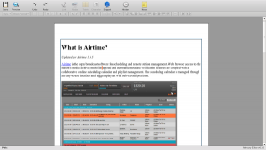
The new generation of HTML5 editors have taken a large step forward, not because they integrate HTML5, as such, but because they act on the elements in the page directly. That allows ‘the page’ to be the editing environment which in turn opens up the possibility for the content to be represented in a variety of forms/views. By changing the CSS of the page, we can have the same content represented as a multi-column editing environment (useful for newspaper layout), as a ‘google docs type’ clean editing interface (see demo below), a semantic layout for highlighting paragraphs and other structural elements (important for academics) as well as other possibilities….

wysiwyg_1

Additionally, it is possible to apply other javascript libraries to the page, including annotation software such as Annotate It or typographical libraries such as lettering.js. This opens up an enormous amount of possibilities for any use case to be extended by custom or existing third party JavaScript libraries.

It is also possible to consider creating CSS snippets and applying them dynamically using the editor. This is in effect turns the editor into a design interface, which will open the path for in-browser design of various media.

Lastly, WYSIWYG editors, while marvellous in their day, have had their day. They feel too pokey and ‘old school’. Largely due to the success of Google Docs users no longer want to poke around in a tiny WYSIWYG editor. They want large clean interfaces for content production.

wysiwyg_2

The above screen shot is taken from the semi-functional demo at http://data.flossmanuals.net/mercury/index.html (all demos work only in Chrome for now).

In brief summary, essential problems of the current WYSIWYG world are:

  1. it is not easily possible to enable JavaScript libraries to act upon the objects in the editor
  2. representing the content in context is difficult
  3. the content is not part of a page so additional functionality like (non- intrusive) annotations cannot be added to content
  4. dynamic rendering of content retrieved from the server is hard to achieve
  5. dynamic creation of content is hard to achieve
  6. inclusion of nested JavaScripts is hard to achieve
  7. they look ‘pokey’ and old school
  8. synchronous editing is possible but hard to achieve
  9. users want to see the content they are making in a much cleaner and clearer ‘fullpage’ way
  10. some users want semantic views
  11. some users want design views
  12. all users must be able to edit the content (designers, editors, content creators, etc) and do what they need from the same view

Online book production has special needs such as the ability to display the content as it might appear in the output, annotations, draft view etc.

The Ideal Editor

A short list of starting list of features for a new editor might look something like this:

  1. harmonise edit, draft, proof, design features into one view
  2. live chat
  3. short messages which also support ostatus API (which is built on Twitter spec)
  4. send to renderers from within the editor
  5. ability to switch on and off third party JS libs
  6. apply CSS templates to content
  7. create CSS snippets
  8. add snippets to templates
  9. share snippets and templates
  10. dynamic snippet rendering
  11. live template swapping including semantic layout and ‘output’ view
  12. synchronous editing
  13. per ‘chunk’ notes

Many of these features are relatively easy to achieve, others will take some careful thought and planning.

The Dream features

  1. backend hook up to git
  2. versioning of content especially for different outputs (A4 vs A5 pages, html, epub etc)

Where to start

We need to develop with an editor in the hand. The current batch of html editors does pretty well but we need to choose one which has a good support community and a good feature set. Currently, there is just one option – Mercury editor. It currently has a new home page (less than 2 weeks old), and a thriving community.

Some demos if what could be done with Mercury in a book production environment:

http://data.flossmanuals.net/mercury/index_semantics.html

http://data.flossmanuals.net/mercury/index.html

http://data.flossmanuals.net/mercury/index_hyphen.html

http://data.flossmanuals.net/mercury/index_prettify.html

If anyone would like to work on this, please contact me adam@booki.cc

If you want some more convincing,  try this math editor using Mercury and MathJax…  http://data.flossmanuals.net/mercury/index_math.html
Try typing $f(x)$ into the window to see how it works

Or try this to see how AnnotateIt works in this environment.