Prior to the net, visualising book production was tricky since the information either wasn’t recorded or was embedded in ungainly ‘record changes’ data in word processing files. So the few examples were preceded with some forensic historical research. One wonderful pre-Word example is The Preservation of Favoured Traces by processing inventor Ben Fry. He visualises the production of The Origin of Species over time to illustrate Darwin’s evolving thesis. Rather appropriately, his is a nice visualisation of the evolution of a book.
This is where the web steps in and changes the game. Online book production platforms enable you to store and retrieve historical data and use it as you like. You can record and access information quite easily. Information such as who is actively working on a book and when, how much they changed, what they changed, who else was online, word counts over time, is all available. If we could access and process this information in chunks, it could perhaps help us to make books better.
Just to show you where this might go, the following are simple prototypes Juan Barquero and I put together using real data from the online book production platform Booktype. The nice thing about Booktype is that it already has all this data recorded in the history for each book, so we could write a visualisation application and then look back over the history of many books. So we made a simple API (Application Programming Interface) and Juan put together a few demos using the JavaScript visualisation library D3JS. The following are some images taken from these trials:
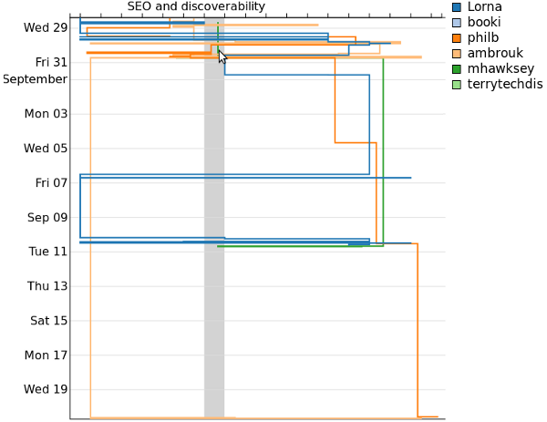 Contributions to chapters (x) over time (y)
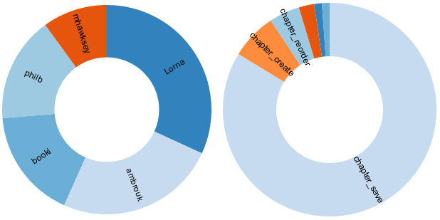 Proportional contributions per contributor
These are just a few simple and raw examples that are of course very far away from being production-ready. However, they serve as interesting prototypes for thinking about how this might look and what we might learn from such techniques in a production environment.
Originally published on O’Reilly, 4 Feb 2013 http://toc.oreilly.com/2013/02/visualizing-book-production.html